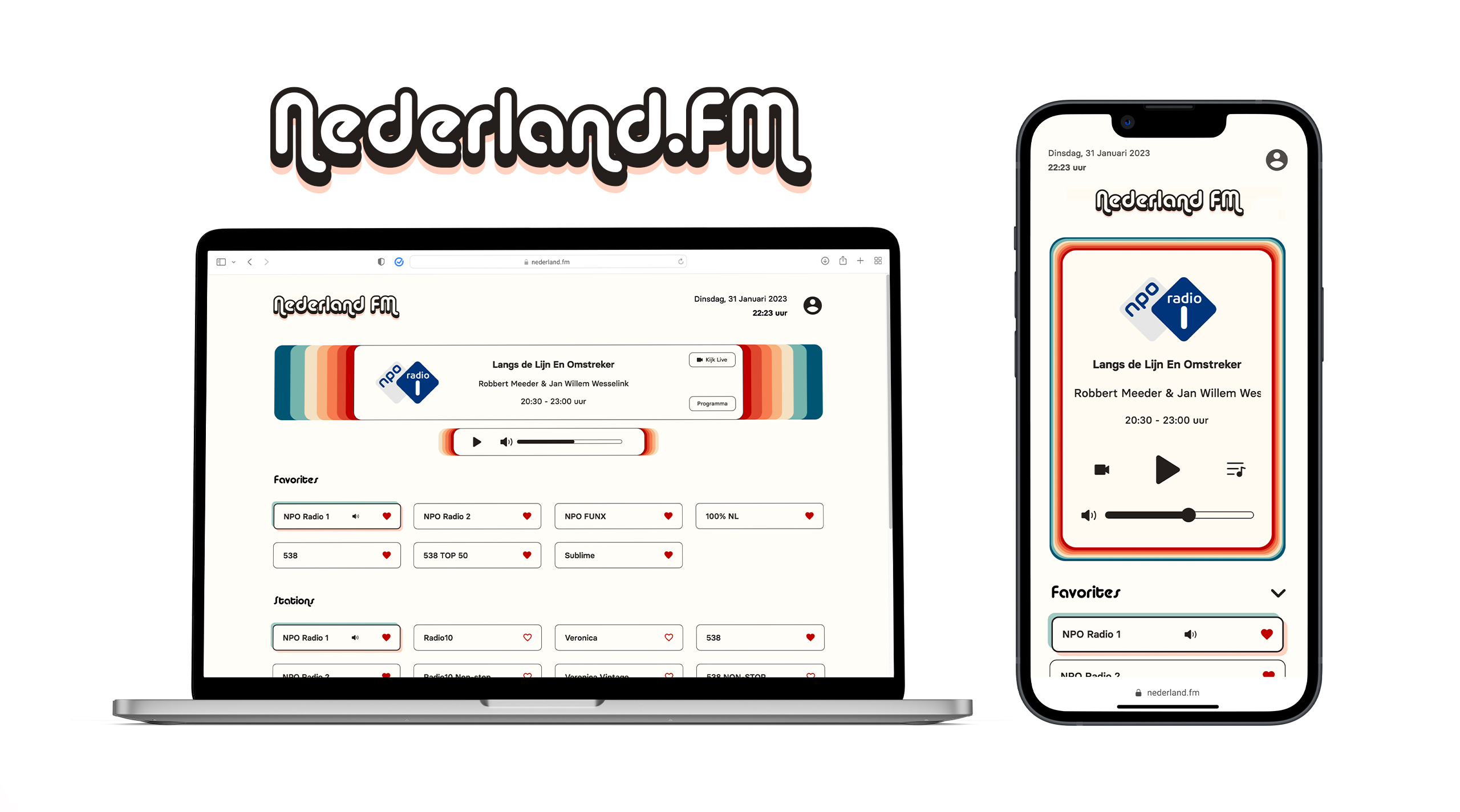
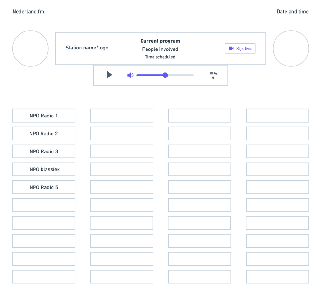
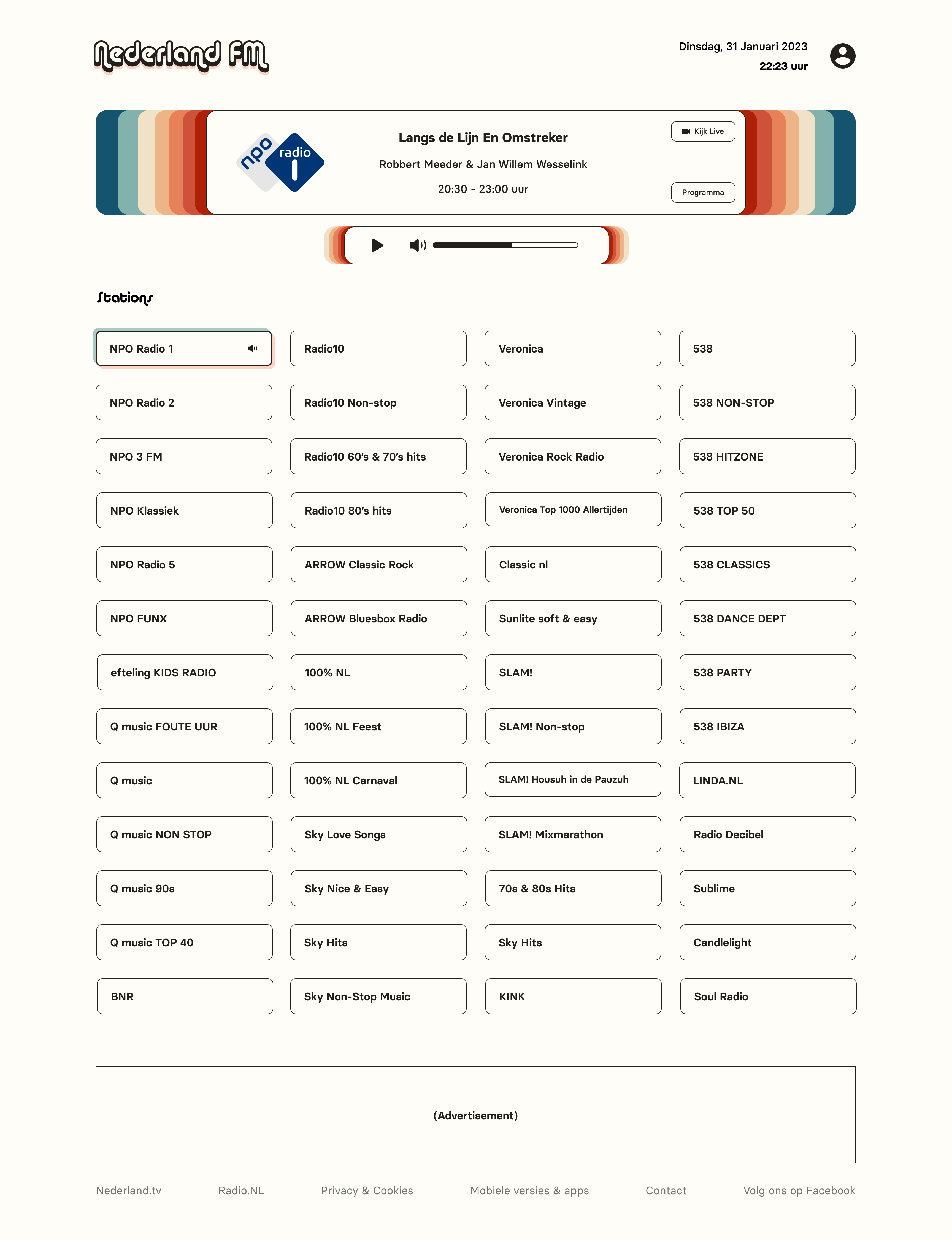
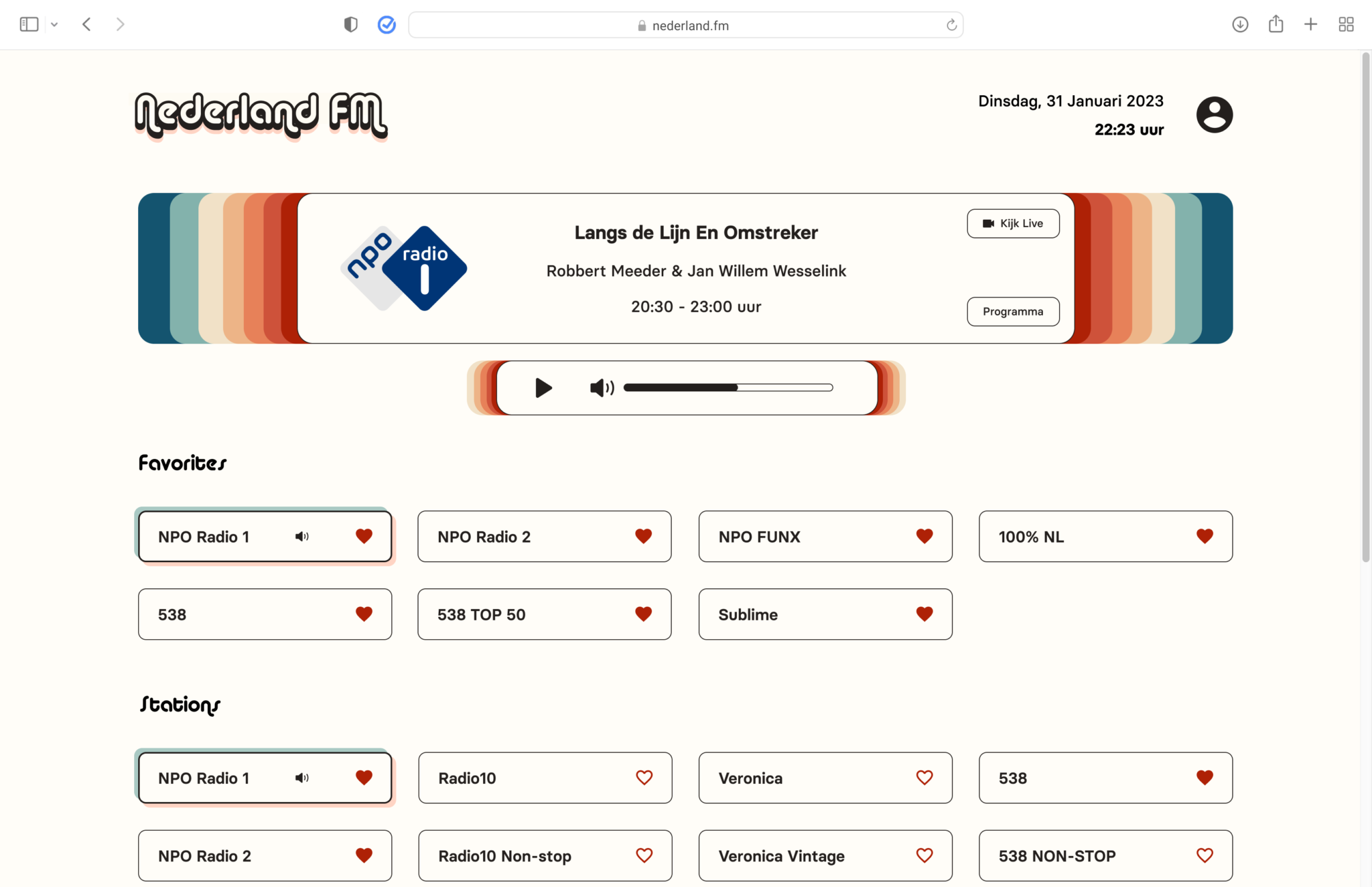
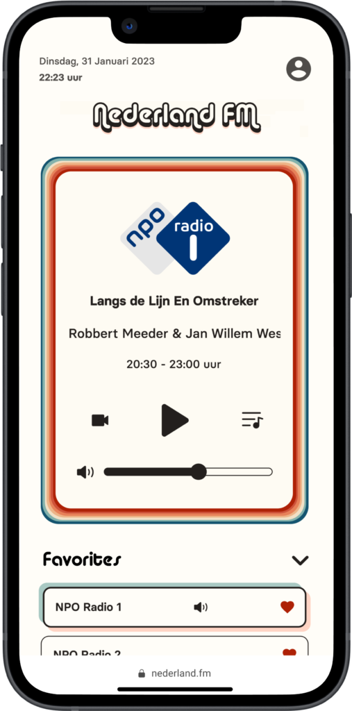
Redesigning
Nederland.FM
Online Radio
DISCLAIMER
I am not affiliated with Nederland.FM in any way. The views for this case study are strictly my own. I have limited access to user data, so this case study is not fully comprehensive. This project was purely for my own development and to challenge myself.
THE PROJECT
Redesign Nederland.FM's online radio web app to improve usability and user experience.
WHY?
Fun personal project
What is Nederland.FM?
It's a free website that offers...
52
Dutch radio stations
24/7
Live streaming
Nederland.FM is wonderful –
Without it, I couldn't practice my Dutch listening skills and I would miss out on the privilege of not being able to understand what the folks on NPO Radio 1 are saying!
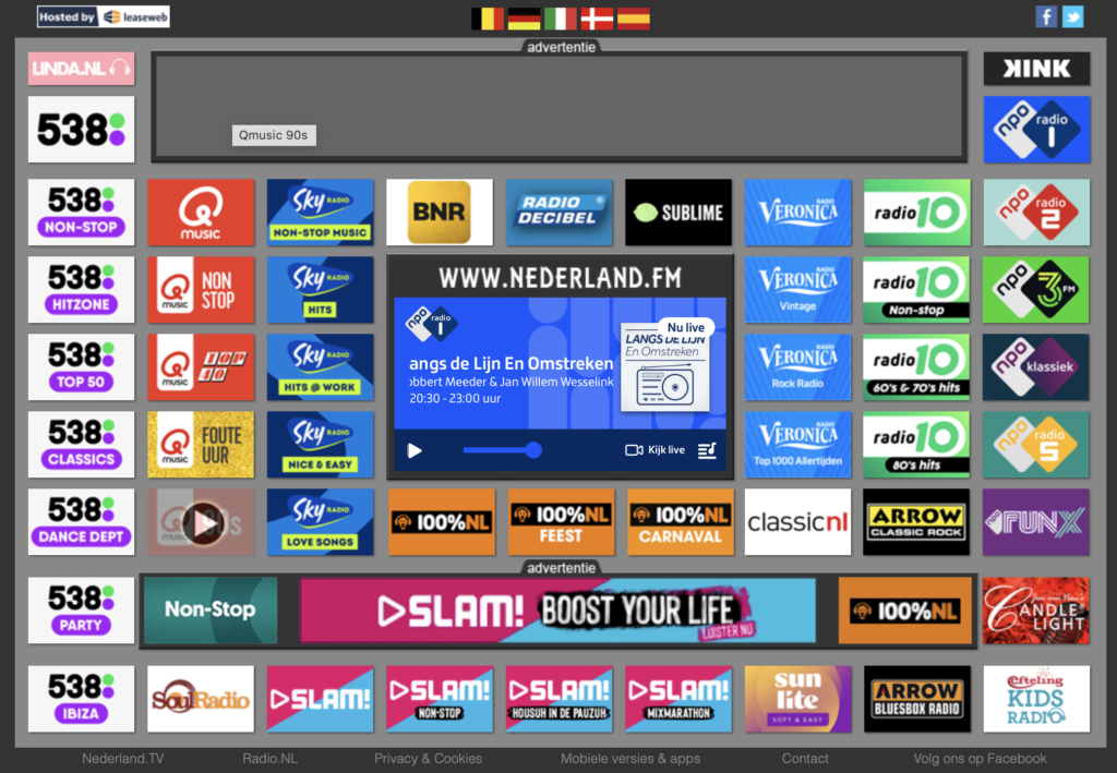
But, what does it look like? Take a look!
It's a simple web app, but I struggled in one key area:
Navigating the page
The large variety of bold colors in a small area and the lack of visual hierarchy makes it very difficult to scan.
So, should I keep the bright and bold logos?
PROS
Could help with recognition for people familiar with station branding
Stations may want to keep their branding intact
CONS
They compete for attention, making the page VERY busy
Difficult recognition for those without brand familiarity
Let's test it out!
METHOD
Tasked 15 participants with finding a station, chosen at random, on each version and timed how long it took for them to do this.
WINNER
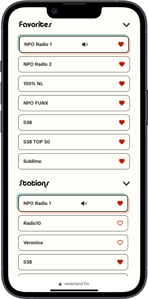
Simple buttons with no logos
RESULTS
On average, it took participants 28% longer to find radio stations when logo buttons were used.
I wanted to keep a retro vibe, though, so I drew from a color palette I used to paint a skateboard.

Chosen fonts:


Chosen color Scheme
Interface Colors

Rainbow Graphic

