The Project
To redesign the Venmo app to be more user-friendly while keeping the original branding and style.
Disclaimer: I am not affiliated with Venmo in any way. The views for this case study are strictly my own. I have limited access to user data, so this case study is not fully comprehensive. This project was purely for my own development and to challenge myself.
Update
Venmo has corrected some of the issues that I identified. With this being a personal project to challenge myself and learn from, it is validating to see that the company and their team came to some similar conclusions that I did.
Update 9.20.0 – May 4, 2022
- Venmo removed the “incomplete” page that showed incomplete requests.
- Venmo removed the “transactions” and “stories” tabs.
- The profile page now shows requests, incoming and outgoing, transactions, and bank transfers.
- This new activity stream on the profile page is similar to that of the activity page I proposed in this redesign.
What is Venmo
Venmo is an American mobile payment platform owned by PayPal. It is aimed at friends and family who wish to split bills and exchange money without the hassle of traditional means, such as bank transfers, checks, and ATMs. On the IOS app store, Venmo is the #3 finance app in the United States, behind Cash App (#1) and PayPal (#2).
Why redesign it?
I’ve heard the phrases “Can you Venmo me?” and “I can Venmo you.” more times than I can count. Despite its popularity in my social circle, few people claim actually to like it. I’ve had my fair share of mishaps. For example, I accidentally Venmo’ed my friend $15 three times (totaling $45) when I had meant to Venmo request him $15 just once. I’ve witnessed many friends click back and forth between pages, unsure where to find their pending requests. One friend said, “I only interact with Venmo when I absolutely have to.” After witnessing many apparent usability issues, I decided Venmo would be perfect for my redesign case study.
Goals for redesign:
- To deliver a convenient and intuitive user interface
- To narrow the scope and intentions of the app
- To challenge myself by addressing problems and proposing solutions
- To practice mediating between corporate / profit interests and user-centered design
App analysis
To form a solid understanding of the architecture, navigation, and functionalities of Venmo, I needed to do an in-depth analysis first. As a result of this analysis, I could identify some pain points and usability issues.
What are the core features of Venmo?
Send money
Request money
Withdraw or deposit $
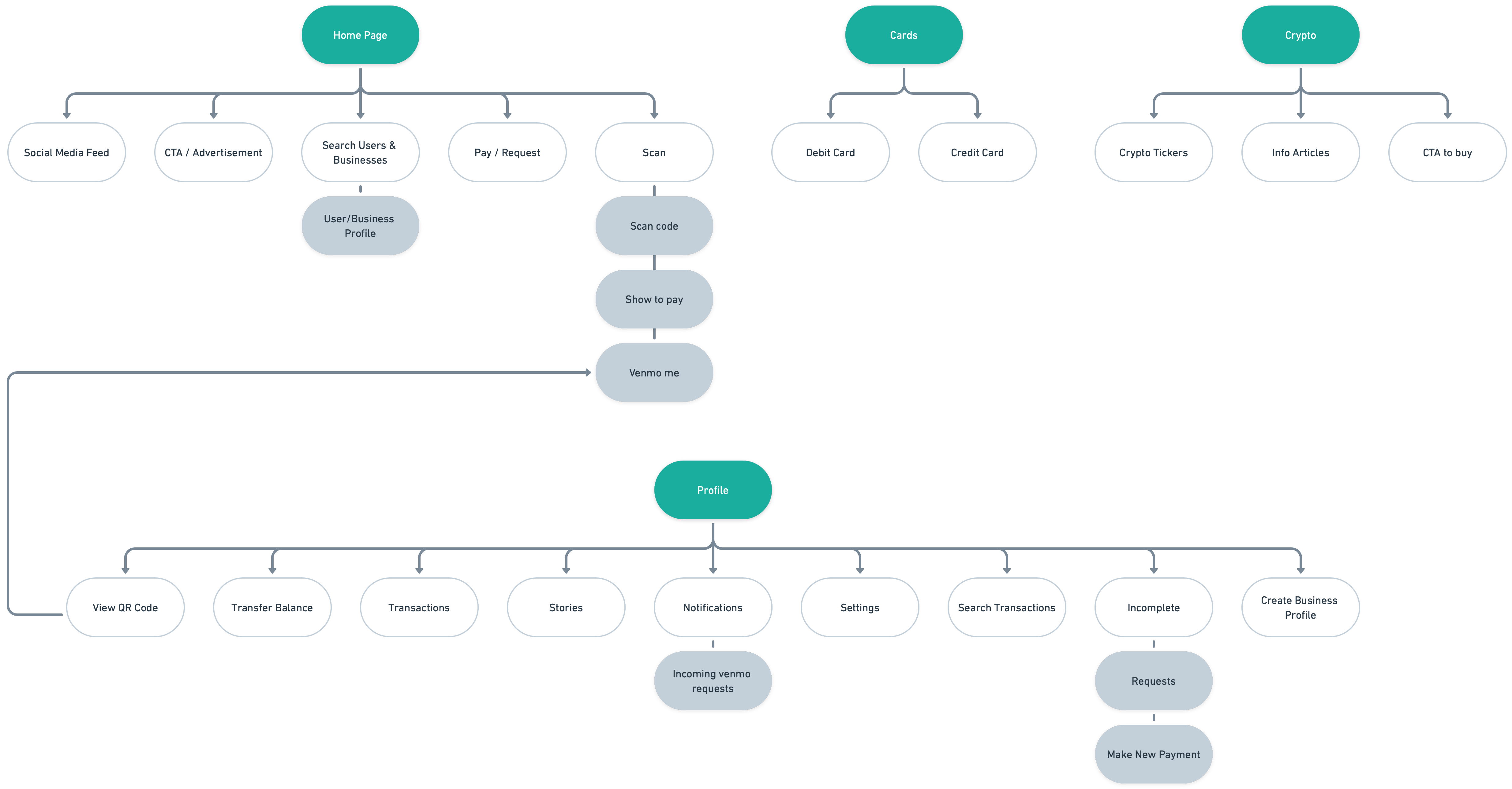
How is Venmo organized?
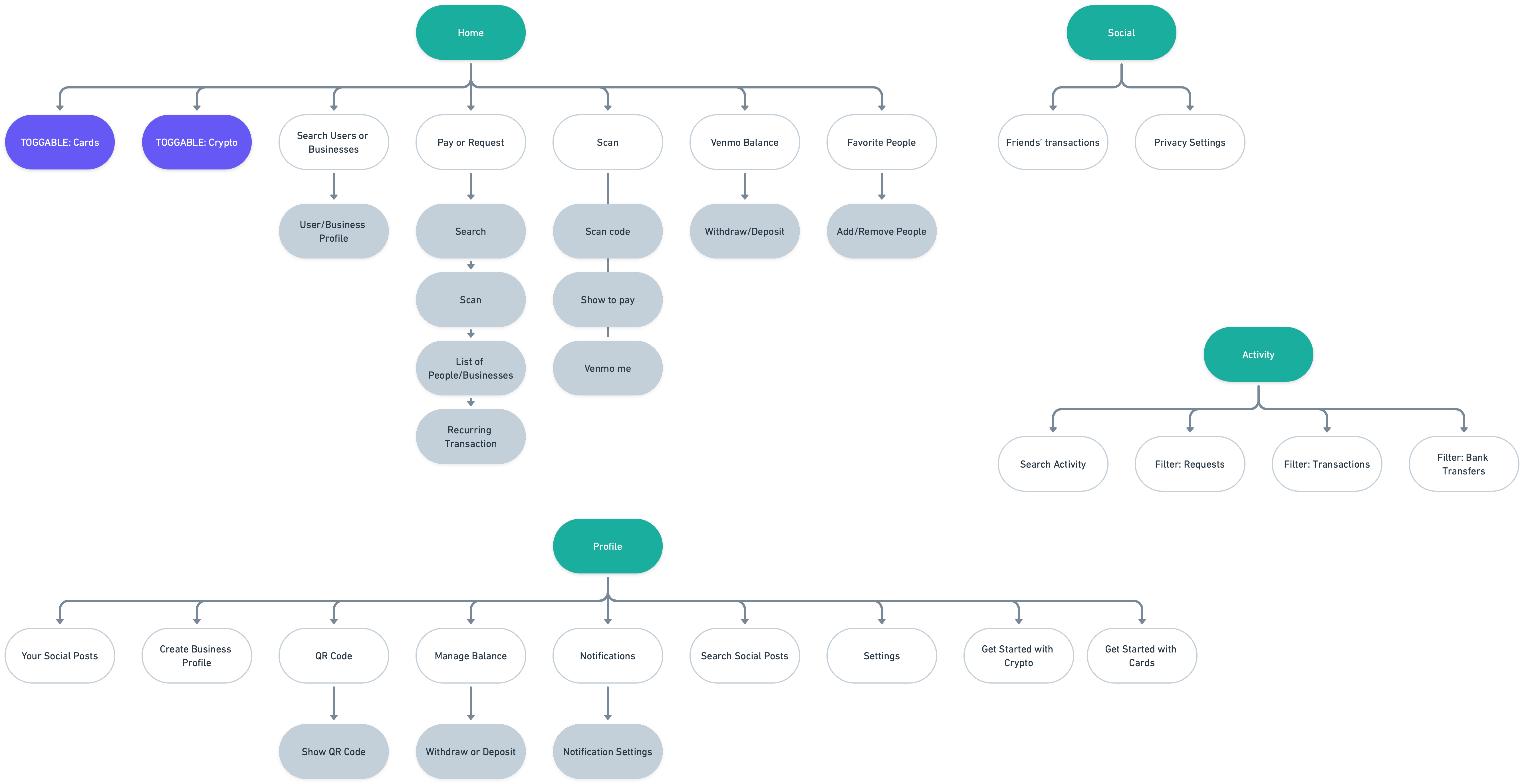
Venmo is divided into four main sections: Home, Cards, Crypto, and Profile. Disclaimer: I do not use Venmo Credit/Debit or their Crypto wallet, so I have limited access to in-depth information about those pages.
Looking with a critical eye
To start, I picked through the app, taking notes on possible issues that stood out to me.
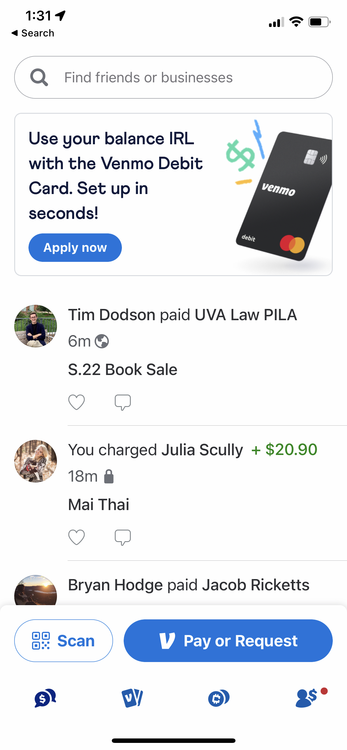
- The main functions of Venmo are to send and receive money, but the app does not immediately reflect that.
- Social media is the focus of the homepage.
- Requests are hidden behind small buttons.
- Outgoing and incoming requests are in different locations.
- The request and pay buttons look too similar, making it easy to click the wrong one accidentally.
- “Transactions” vs. “Stories” on profile – what is the need for “stories”?
- Should Venmo balance should be on the homepage?
Understanding users
While I can quickly establish my pain points, understanding how Venmo’s user base feels about and interacts with their app is more important. To do this, I used reviews, interviews, and surveys.
What do the App Store reviews say?
Reviews are vulnerable to volunteer bias. This results from reviews frequently being left due to strong emotions, whether those are positive or negative. While not a reliable source of general opinion, they can still shed insight into common complaints.
Common complaints
- Poor privacy
- Privacy settings are automatically set to public
- Automatically uploads contacts
- Confusing organization
- Unnecessary features and redesigns
Usability testing
I reached out to people in my network who use Venmo to get valuable insight into specific pain points.
Key findings
- Several users only use Venmo (as opposed to something like CashApp) because their friends use it
- Users frequently check their Venmo balance before sending money
- Users hesitate and/or have trouble finding outgoing requests
- Users did not use the “stories” on the profile page
- Users did not use the “payments” tab under “incomplete”
User surveys
Due to my limited resources, I decided to use Instagram polls. This limits the scope of my results as they likely do not represent the general public. Those that answered the polls are primarily middle-class, college-educated (bachelor’s degree), and 20 to 30-year-olds. This is a limited demographic, but it is a demographic that uses Venmo frequently.
Key findings
Defining problems
Pain point 1: Social feed as homepage
Users are confused about why the social feed is front and center when using the app.
The “Pay or Request” buttons are arguably the most important in the app, but they are relatively small and at the bottom of the screen
Pain point 2: Privacy
Users feel Venmo's privacy decisions are not in the user's best interest.
- When you open an account, the default privacy setting is set to “Friends”.
- Venmo automatically uploads your contacts and, if connected through FaceBook, will upload all your Facebook friends to your Venmo contacts.
Together, this means that your Venmo transactions are likely visible to hundreds of people immediately. To change this, you need to go to the profile page and search through the settings.
Pain point 3: Difficult to find requests
Incoming and outgoing requests are scattered over the profile page.
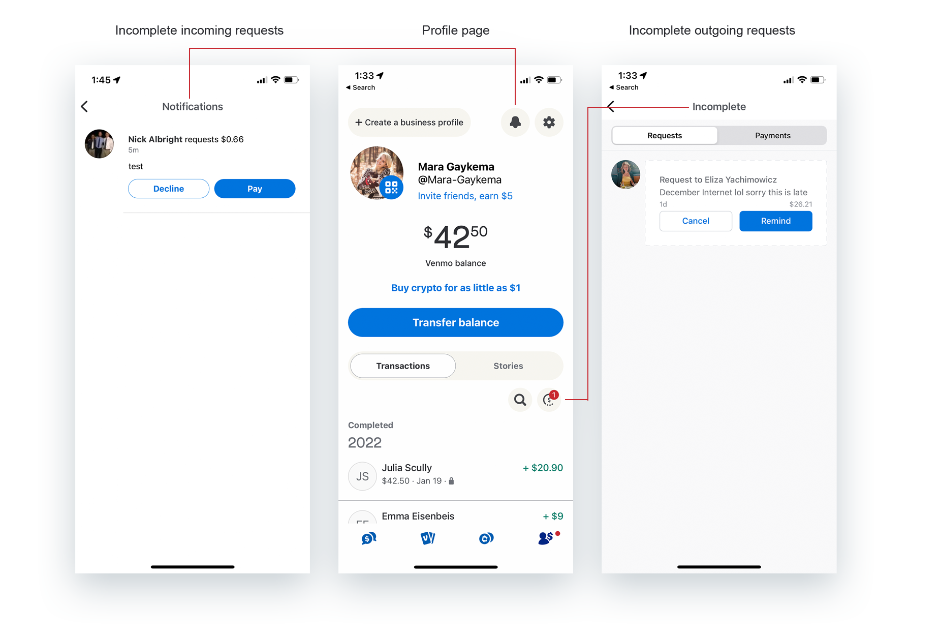
Pain point 4: Unnecessary features
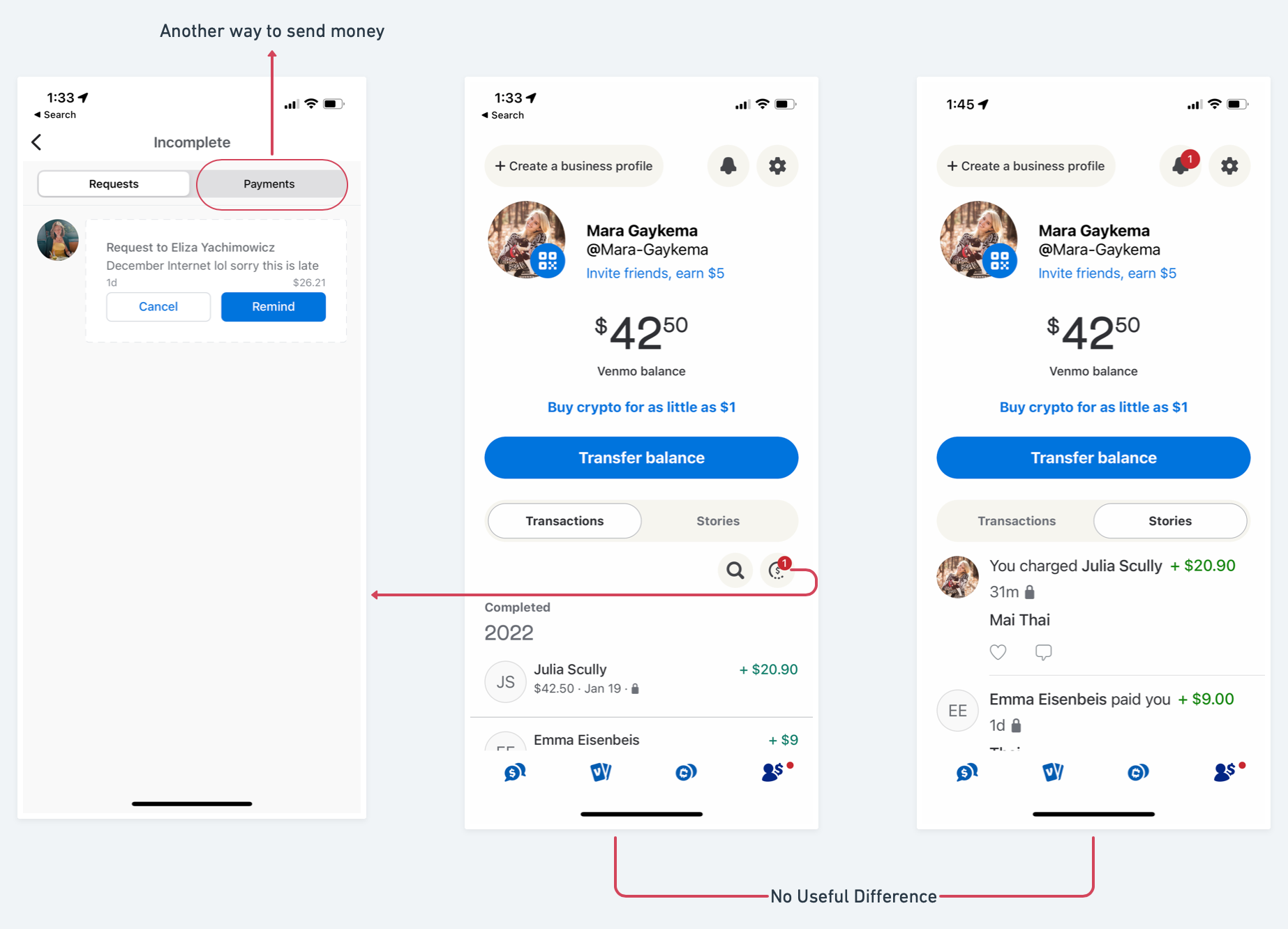
Repetitive and unnecessary features take up valuable space
(Left) Payments tab is another way to send money. Why use that when you can use the homepage?
(Middle) Transactions tab shows all instances of sending or receiving money.
(Right) Stories tab shows all instances of sending or receiving money, but in the form of your social media posts.
Why have both transactions and stories?
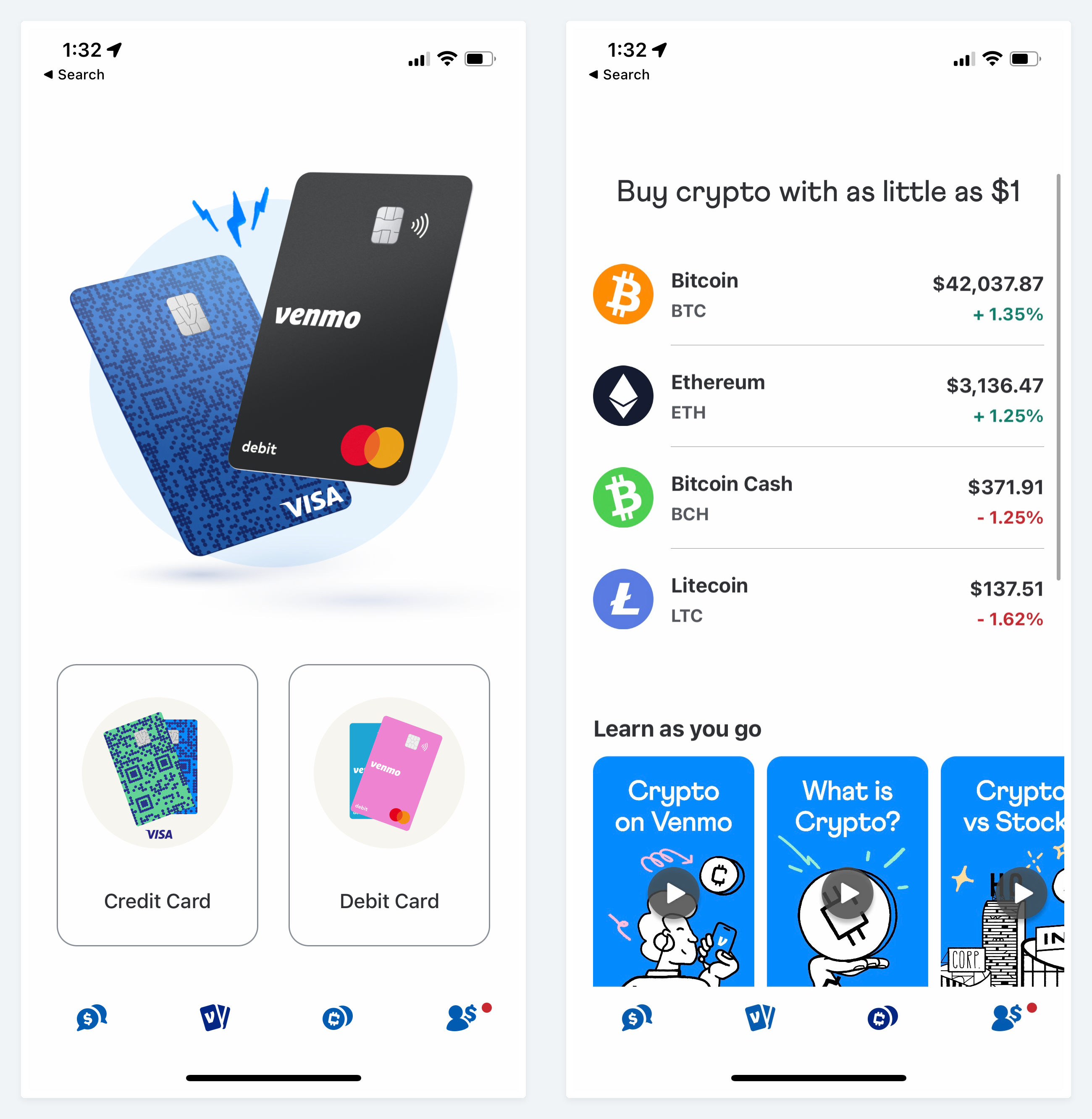
Users do not utilize the cards and crypto enough to justify their emphasis
Based on my (limited) user research, just 4% of users use Venmo Cards, and 0% use Venmo to trade Crypto.
For 96% of users, the middle two tabs are completely unused.
Pain point 5: Unintuitive details
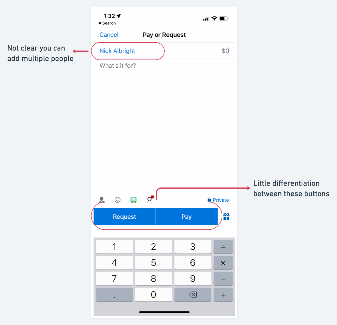
Adding more than one person to a transaction is possible, but you would not know it unless you clicked the name.
“Request” and “Pay” are opposite actions. Clear visual clues to signify these differences are important, especially when finances are involved.
- The uniform color, typography, and thin line separating the buttons are confusing when moving through the app quickly.
Proposing solutions
New architecture
In this proposed architecture, I have made the following major changes:
- Removed “Cards” and “Crypto” from main tabs
- Opt-In: They are now features that will appear on homepage when users toggle them on
- Moved social media to its own tab and added privacy settings
- Added an “activity” tab with requests, transactions, and bank transfers
- Removed “stories” and “incomplete” from profile
Final product
Pain point #1: Social media as homepage
Reprioritizing the homepage
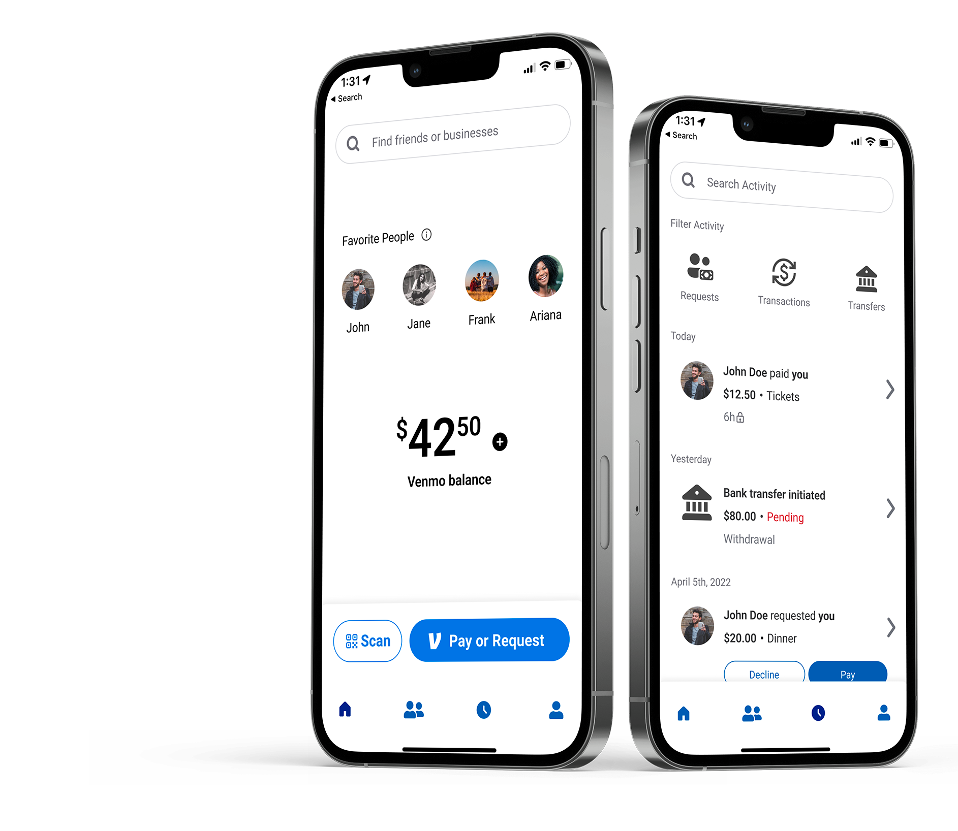
While a significant portion of users enjoy the social media aspect of Venmo, it is not a high enough priority to make it the homepage. Here, I have redesigned the homepage to focus purely on exchanging money.
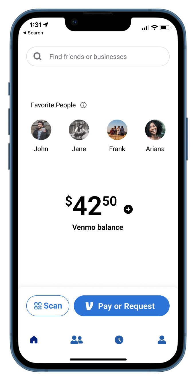
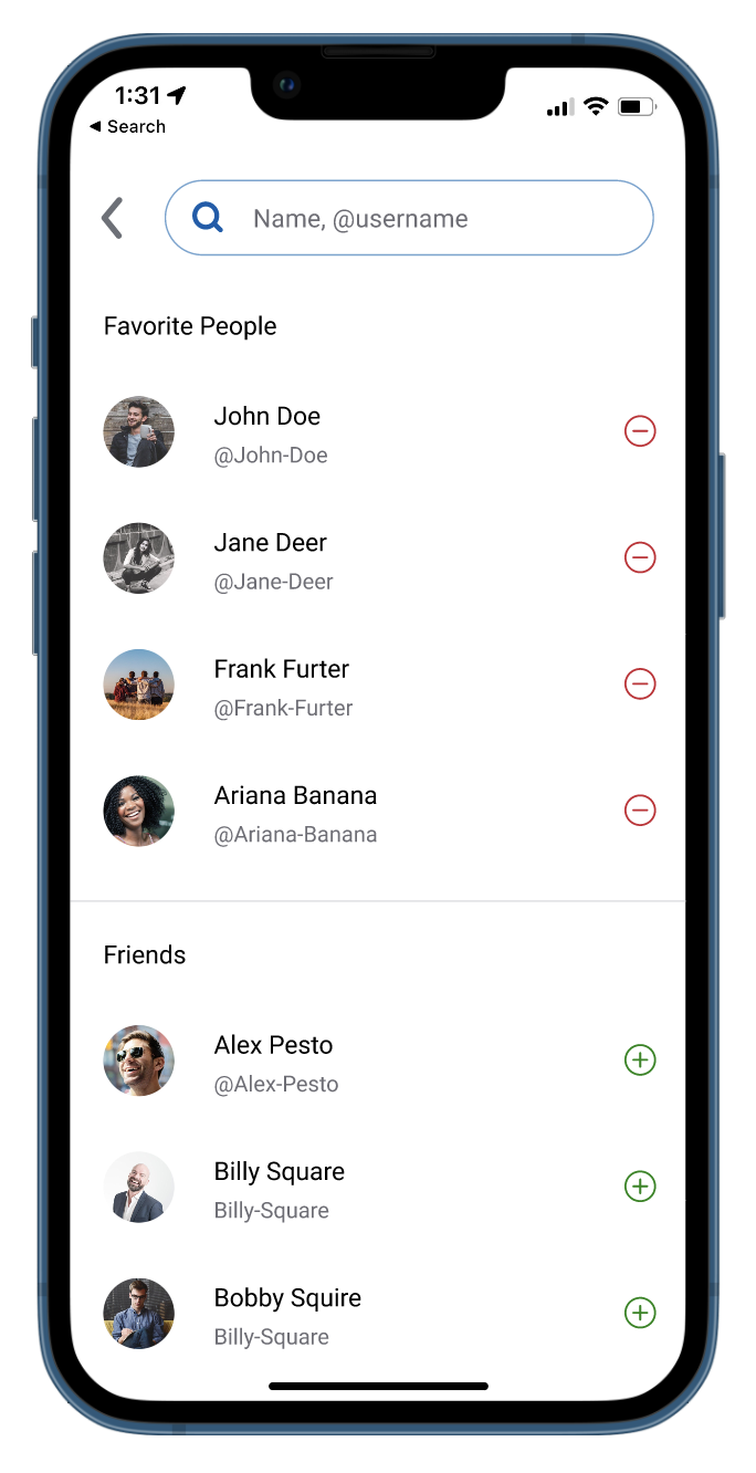
- The addition of Favorite People allows users to select up to four friends that will remain on their homepage, allowing convenience similar to speed dial.
- Displaying the user’s Venmo balance on the homepage lets the user know how much they have first and foremost.
- Allowing the ability to manage the balance quickly
These changes allow users to use the core features of Venmo without ever leaving the homepage.
Pain point #2: Privacy issues
Giving the user more control over their privacy, without digging through all the settings
One of users’ most significant complaints is that Venmo automatically uploads your contacts and sets your transaction history to public. Here, I have added two features to the social media page that gives users quick and easy control over their privacy.
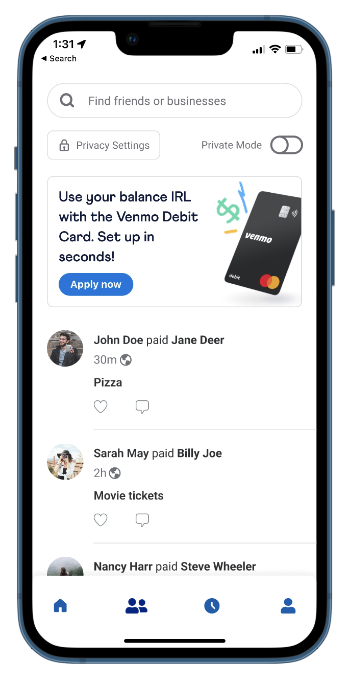
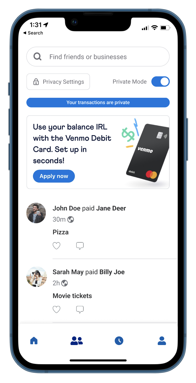
- The addition of a button that takes users to their privacy settings
- “Private Mode” that is automatically set to “On” when you start an account.
- When this is toggled on, all transactions are private between you and other users.
These changes allow users to control who may see their Venmo transactions more easily and conveniently.
Pain point #3: Difficult to find requests
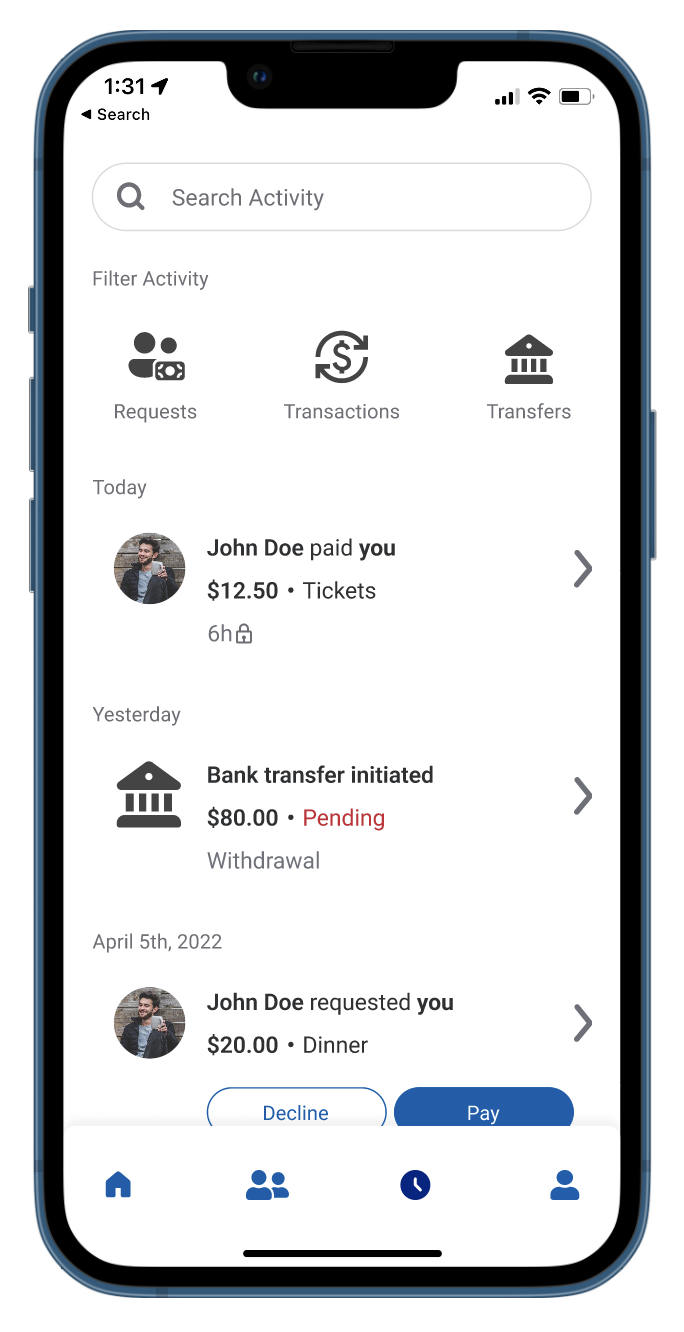
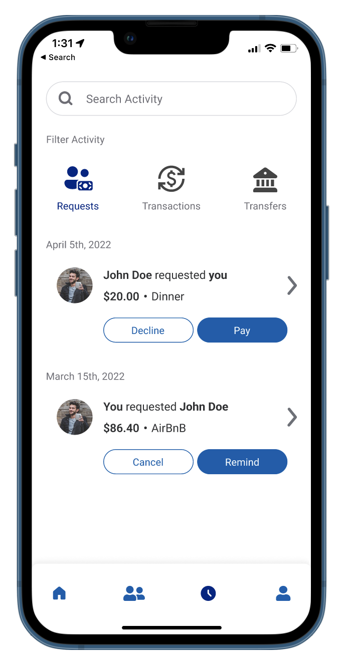
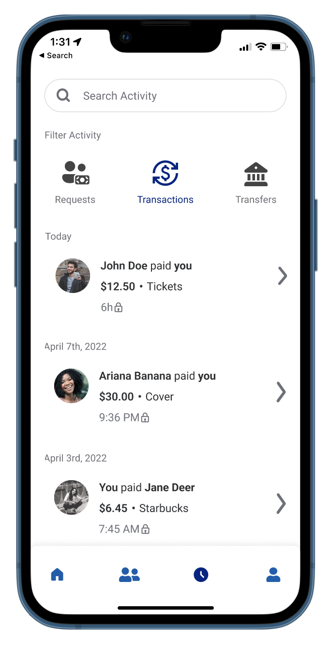
Addition of a new “activity” tab, allowing for all major activity to be centralized and easy to find.
In Venmo’s original design, there is no hub of activity records. I wanted to create one that would provide a simple and intuitive record of major activity.
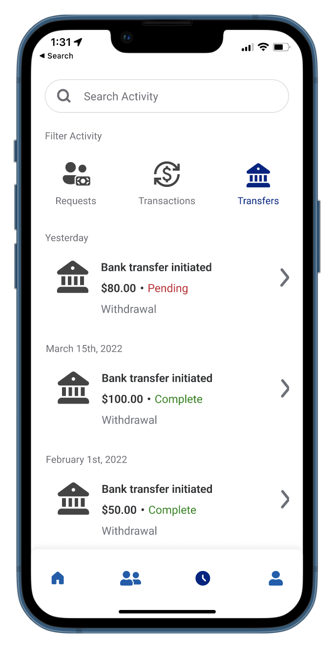
- The default page contains a chronological order (most recent at the top) of all activity, including requests, transactions, and bank transfers
- Activity can be filtered by requests, transactions, and transfers
- Incoming requests can be paid and outgoing requests can be reminded
- Clicking on the arrow next to each action will open a more detailed page about that action
This new page would bring Venmo back to its core features and show that the priority is ease-of-use when transferring money between banks and users.
Pain Point #4: Unnecessary features
Trimmed repetitive components
The profile page is the most information-dense page in the Venmo app, resulting in a confusing interface. In an effort to reduce issues, I slimmed down the features involved.
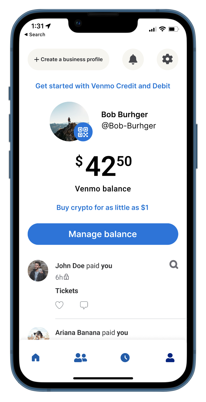
- Since the new “activity” page keeps records of all transactions, the profile page now only shows a user’s social posts (with likes and comments)
- Removed the need for an “incomplete” page with the addition of the “activity” page
- Added links to activate Cards and Crypto, so that it is still an option for users
The profile page is now more simple and straightforward.
Reorganizing and reprioritizing Venmo Cards and Crypto
With such a low percentage of polled users using the Card and Crypto features, I felt it was important to re-evaluate their role in the app.
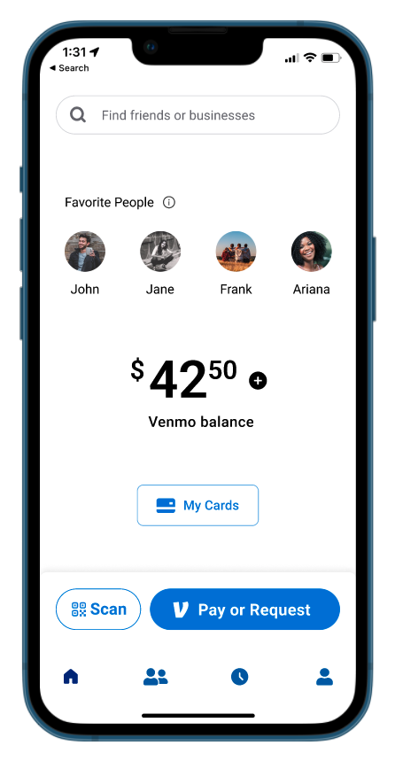

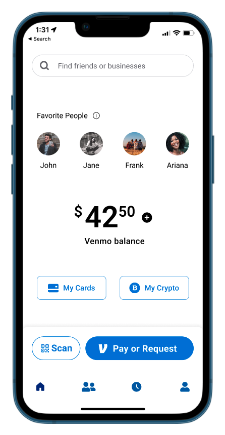
- When users activate either feature using the links on the profile page, it will toggle buttons that appear on the homepage
- Allows for easy and convenient access to the Cards and Crypto pages if a user wants them
- If a user does not participate in these services, their experience will not be intruded on
A smooth compromise between keeping the app centered on core features and corporate interests of expanding into new financial services
Pain point #5: Unintuitive details
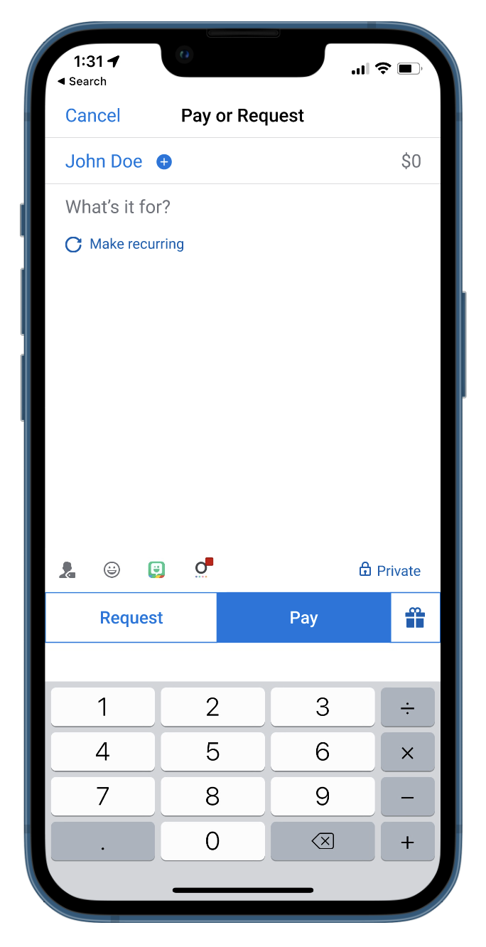
Small changes to “Pay or Request” page
I wanted to change a few small things in order to clear up ambiguity.
- Added a “+” next to the recipient, providing a signifier for the ability to add more people to a transaction
- Increased visual contrast between the “request” and “pay” button
- Bonus: added an option to make a transaction recurring. This would be good for splitting things like rent and internet bills.
These changes allow for users to be more intentional when making a transaction.
Conclusions
Overall, Venmo is a great application that I believe has strayed from its core intentions. They would benefit from focusing on improving current features before adding new ones, because that only serves to alienate their user base.


