UX
Q-Count Software Design Update
Background
Bacterial colonies are groups of bacteria that all originate from a single mother cell. For many labs studying bacteria, counting colonies is fundamental in their research. While many still choose to count colonies by hand, some opt for the convenience of automated plate counters.
One of my research projects relied heavily on counting colonies, and I was fortunate enough to have access to an automated plate counter. I regularly counted plates with 200+ colonies, so this technology saved me time and energy. However, the software was outdated and confusing. My co-workers and I adopted the strategy of “finding a couple of buttons that do the job and touch nothing else” because it was very easy to accidentally change a critical setting and “break” the software’s ability to identify colonies.
While my understanding of the software is limited (I’m sure it is more powerful than I know), I decided to redesign the interface and make some changes to improve usability.
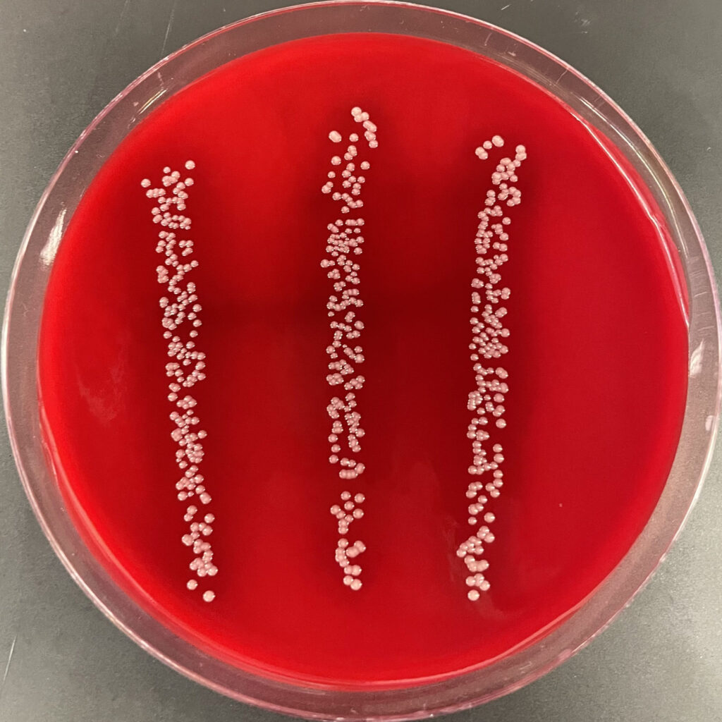
Agar plate with bacterial colonies.
Current Design
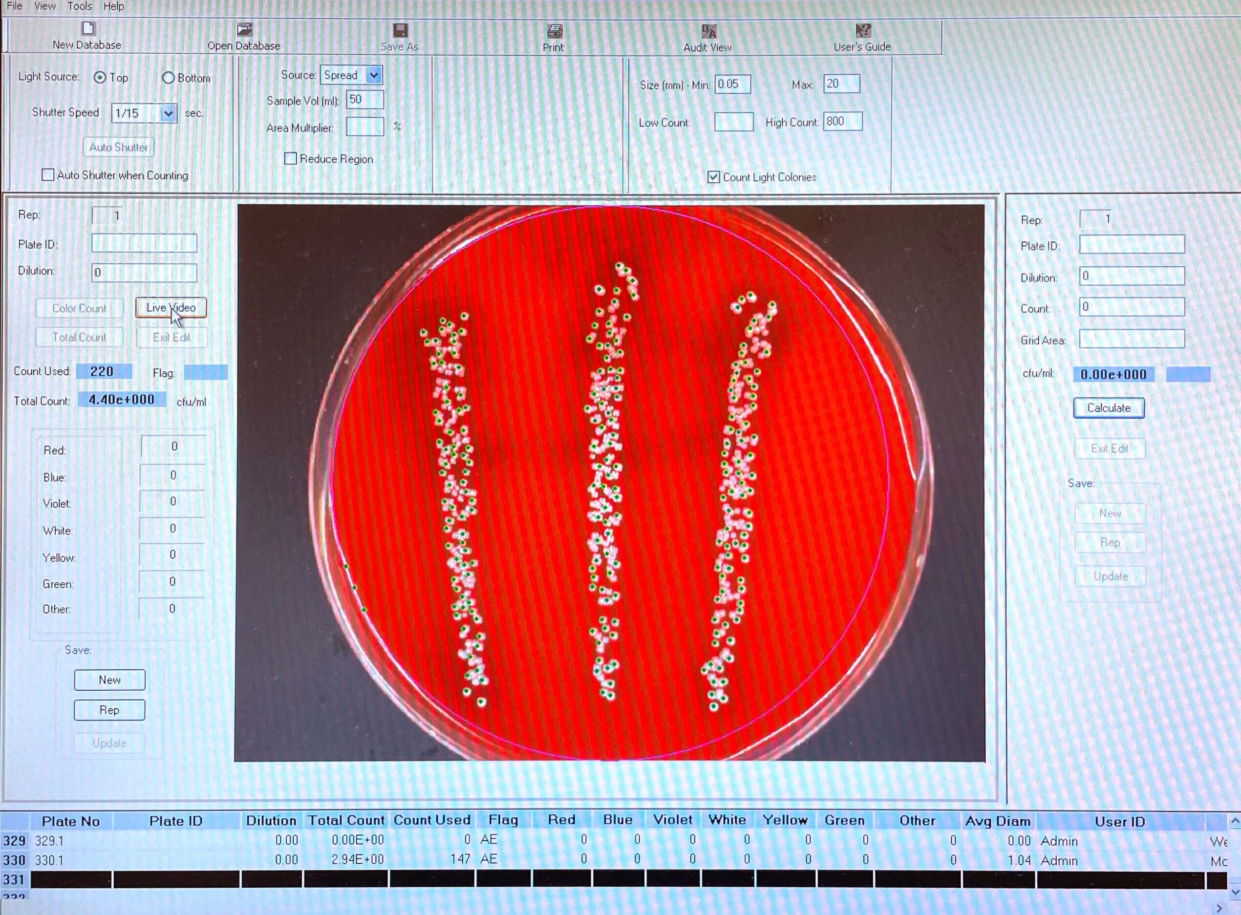
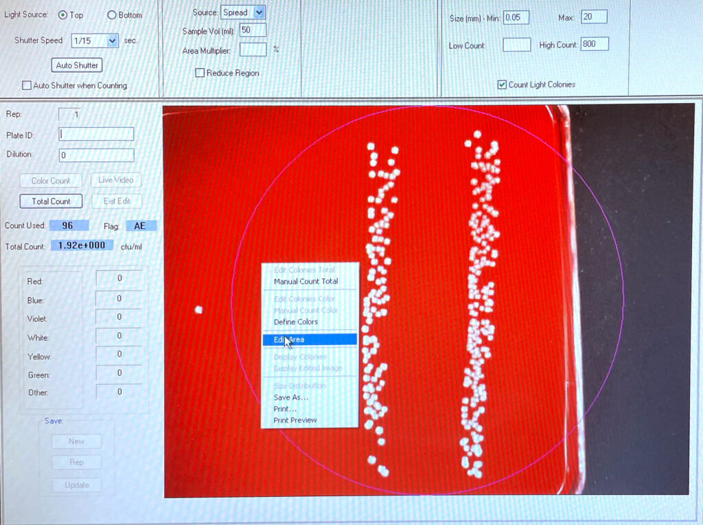
Below are two pictures that show the software’s interface. It has been designed for those who want to count every colony on a circular plate, but this is limiting. Microbiologists frequently have multiple different treatments on single plates, resulting in the need to divide the plate into sections. This software allows for this customization, but it is hidden behind right-clicks. Additionally, there is an unbalanced visual organization and a lack of clear labeling.
Userflow
The following is our lab’s user flow when counting colonies on agar plates. My project used a “drip plate” method that resulted in four rows of bacterial colonies, so we needed to divide the plates’ area. While it is pretty straightforward, the frequent “right click” slowed us down and added unnecessary steps.

Redesign
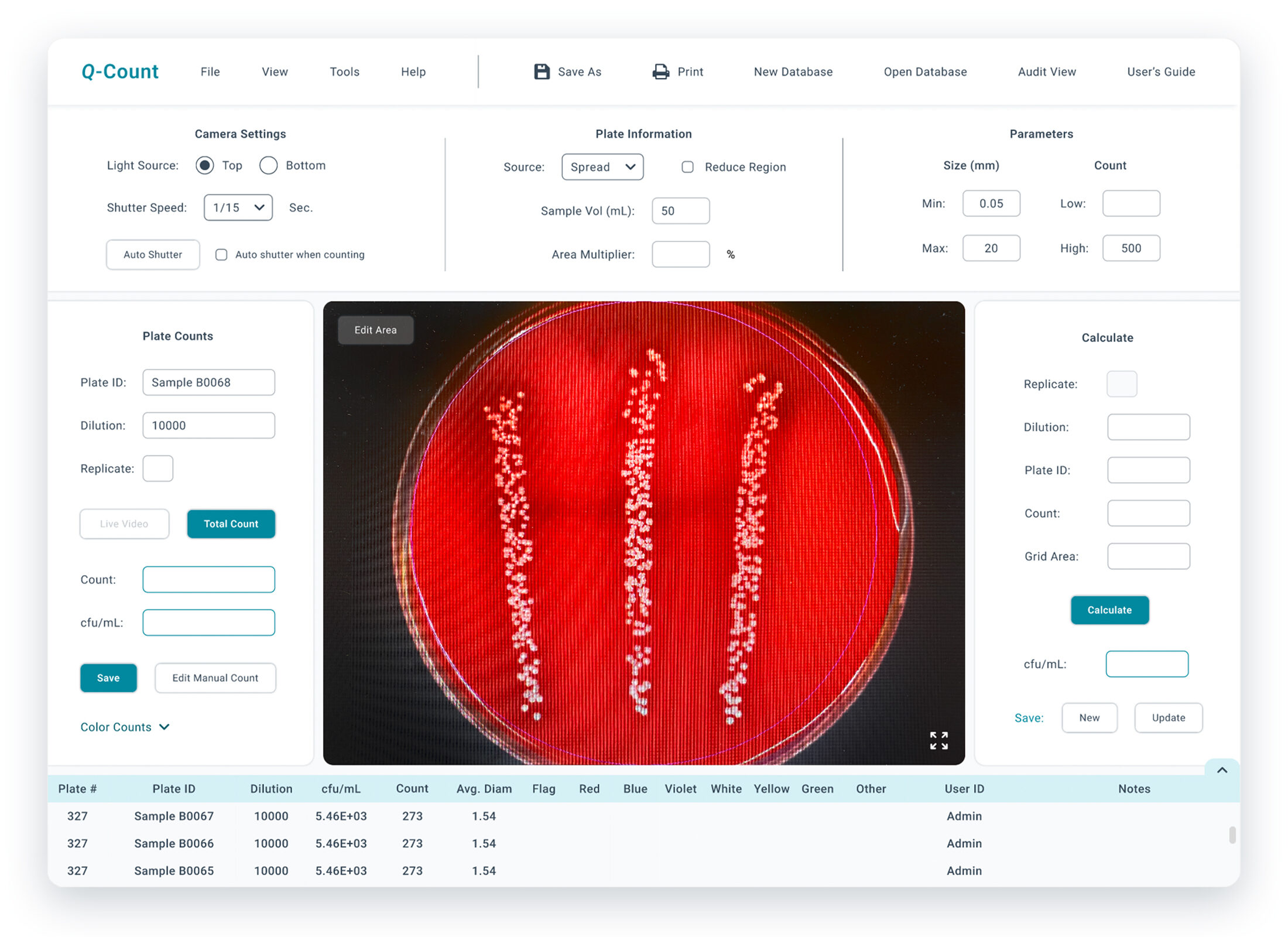
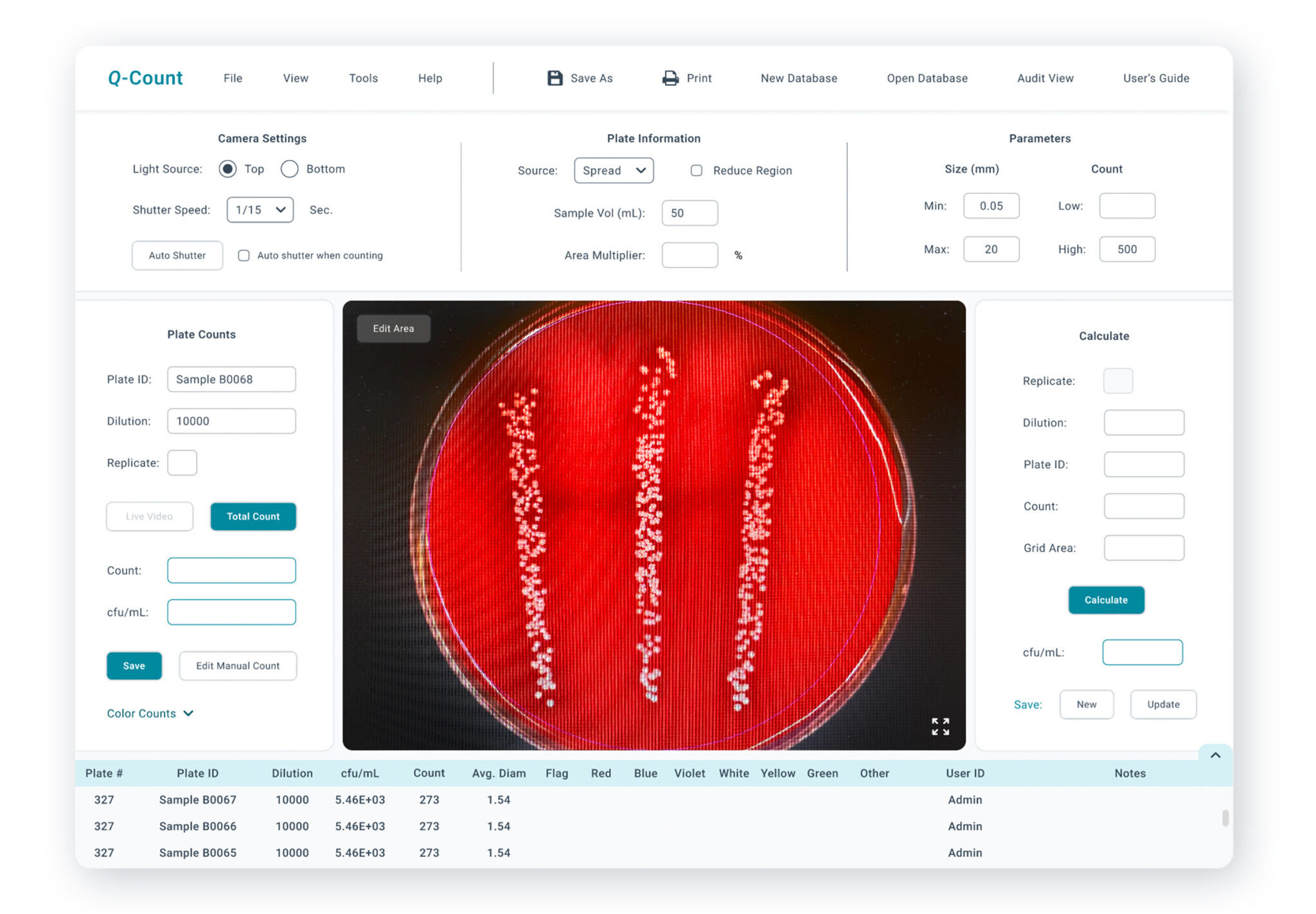
- Updated the visual design to a more modern style
- Reduced unnecessary icons
- Added section labels to help users navigate the page.
- Balanced the page and made more efficient use of space
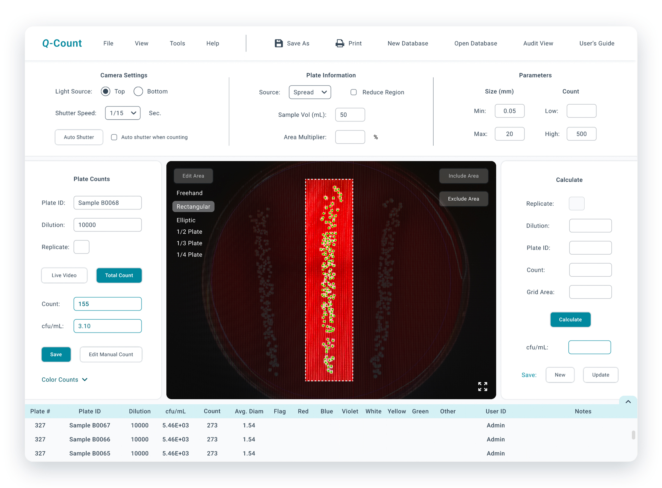
- Added buttons so users can easily access essential features (“Edit Area”, fullscreen, etc.)
Additional Changes
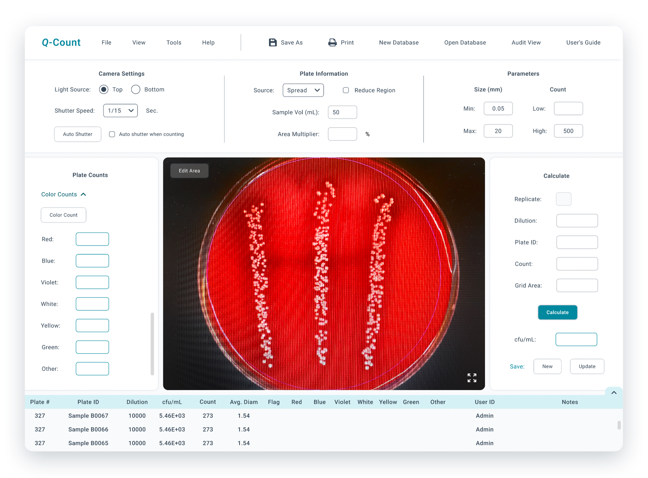
1) Hid the “Color Counts” section under a dropdown so they are still easily accessible while reducing visual clutter
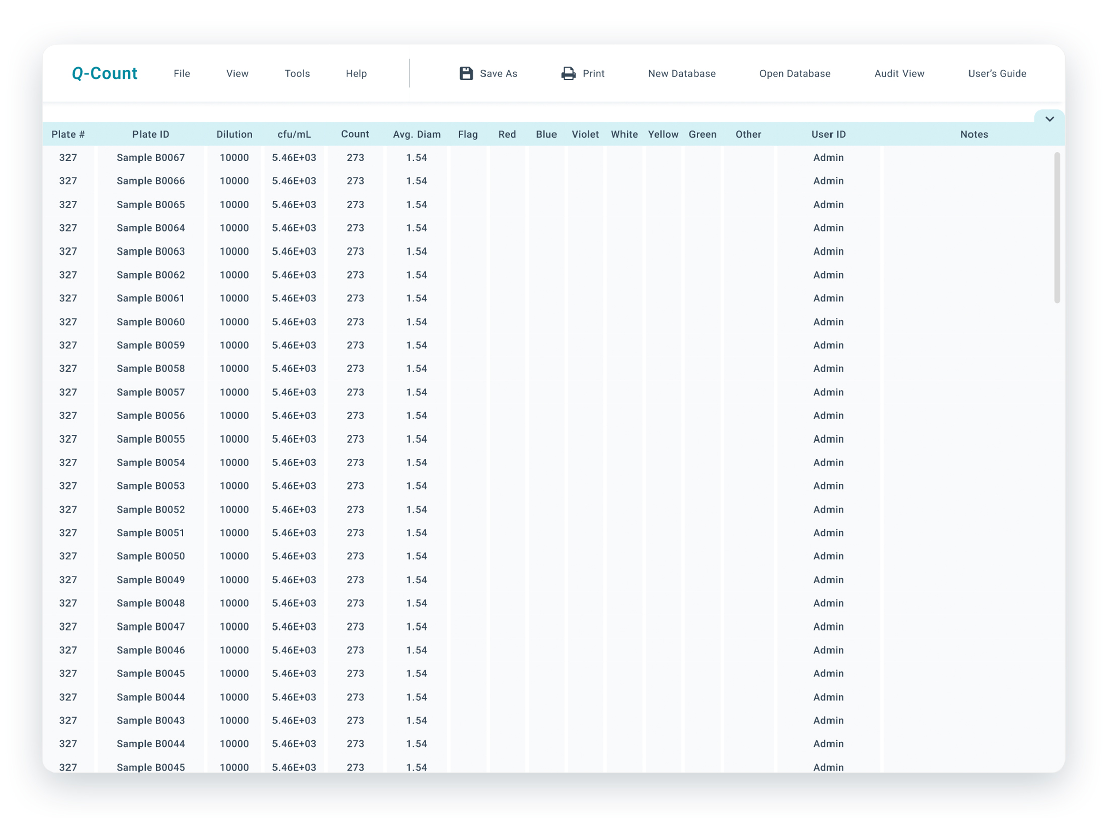
2) Added the ability to expand the data sheet at the bottom of the page. This allows for easy access to data sets.
Updated userflow
When customizing the plate area, the new user flow has three fewer steps than the original. The process is faster and more intuitive without the need to right-click the screen for nearly every step.

Prototype: video
Prototype: Pictures
Final thoughts
Typically, good design takes the mental load off of users and simplifies the interface, but doing this in research software risks sacrificing critical functionality. The needs of researchers vary greatly, and they demand precision and versatility. As a result, the software needs to be robust and customizable while maintaining a user-friendly interface. Designers must understand what information to prioritize while providing clear signifiers for “edge” cases.
